900dpi
From Dropbox to Editable Websites: Creating a CMS for Designers and Their Clients
900dpi is a simple, Dropbox-integrated content management system that allows designers and developers to build editable websites using only HTML and CSS. I led the product and interface design, helping make content editing approachable for non-technical clients while staying efficient for developers.
Role: Product Designer
Scope: UX/UI design, user research, brand direction, onboarding flow, usability testing
Platforms: Web
Year: 2013–2014
Impact
+40%
Successful Site Setup
+65%
WIZYWIG Usage
Problem
900dpi was created to help designers deliver lightweight websites that clients could edit without writing code. But early users faced several barriers:
1. Dual User Needs Made the Interface Hard to Balance
Designers needed a flexible dashboard to manage sites and assign editability, while their clients needed a simple, mistake-proof way to update content. The original product leaned too technical, leaving non-developers confused or afraid to use it.
Designers needed a flexible dashboard to manage sites and assign editability, while their clients needed a simple, mistake-proof way to update content. The original product leaned too technical, leaving non-developers confused or afraid to use it.
2. Setup and Editing Flows Were Not Intuitive
Once connected to Dropbox, users had trouble understanding how to activate editable regions and where to go to manage their sites. Many users failed to get through the initial setup or didn't fully utilize key features like the editor.
Once connected to Dropbox, users had trouble understanding how to activate editable regions and where to go to manage their sites. Many users failed to get through the initial setup or didn't fully utilize key features like the editor.
3. The Interface Lacked Personality and Clarity
The product felt generic and utilitarian, lacking the visual warmth or delight that might encourage creative users to stick with it. The brand needed to feel fun, friendly, and modern—without compromising on professionalism.
The product felt generic and utilitarian, lacking the visual warmth or delight that might encourage creative users to stick with it. The brand needed to feel fun, friendly, and modern—without compromising on professionalism.
Opportunity
How might we allow designers to have full control of the design of their websites while enabling their clients to setup and edit seamlessly?
Goals
Business Goal
Improve activation and retention by increasing the number of successfully launched websites and reducing drop-off during onboarding.
User Goal
Make it easy for clients to confidently edit their sites without breaking anything, while giving designers the tools to manage projects efficiently.
Design Process
01 / Research & DiscoveryI interviewed both developers and their clients to understand their workflows and pain points. Designers wanted quick handoff tools and a dashboard they could control. Clients wanted direct, visual editing without needing to learn a system or worry about breaking layouts.
02 / Flow Mapping
I mapped distinct flows for technical and non-technical users. Designers needed a dashboard to manage websites and collaborators. Clients needed to skip the dashboard entirely and edit content directly on the page. This split led to a clearer architecture and focused UX for each group.
03 / Wireframes
I created mid-fidelity wireframes for the new dashboard, onboarding walkthrough, and WYSIWYG editor. Testing revealed that users didn’t always know where to begin, so I restructured the hierarchy and added contextual guidance throughout the interface.
04 / Visual Concepts
I explored designs that felt light and professional, avoiding both sterile SaaS aesthetics and overly playful UI. I introduced modular components, soft shadows, and bold action areas to reduce friction and draw attention to key workflows.
05 / Final Designs
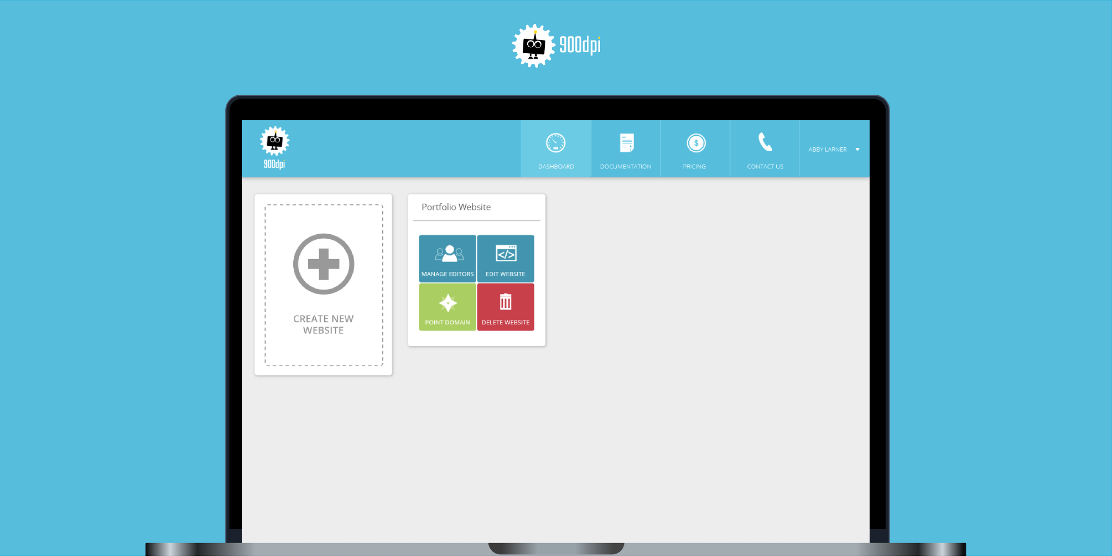
The final product featured a streamlined dashboard for designers and an in-context, WYSIWYG editing experience for clients. The editor allowed users to click and edit content directly on the site, while the dashboard prioritized the most common actions like assigning editors or syncing with Dropbox.
06 / Implementation & Iteration
After launch, we noticed drop-off between signup and full setup. I worked with the team to redesign onboarding, highlight next steps, and reorganize the navigation. We introduced a setup walkthrough and made global vs. project-specific settings easier to locate. These changes improved activation and helped users launch faster.
Brand Architecture & Design
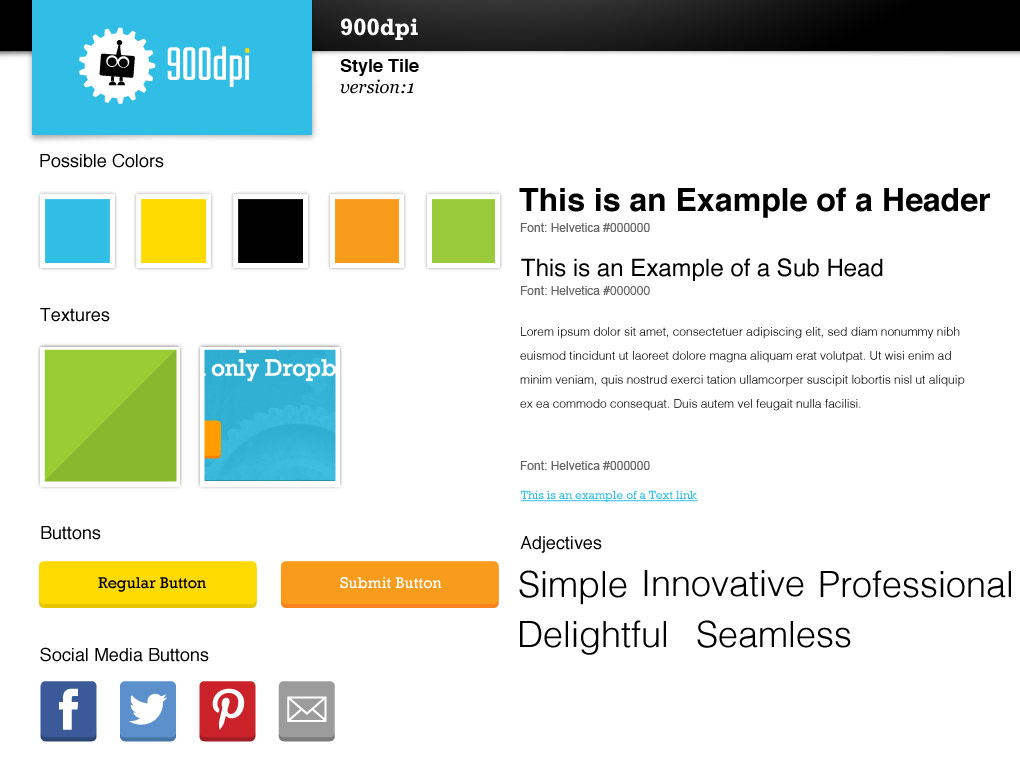
I reimagined the visual identity to reflect simplicity and delight. I designed a friendly new brand mascot (Webster), brightened the color palette, and created a style tile that balanced approachability with clarity. The brand needed to feel like a tool you’d want to use—not just had to.
Style Tile for 900dpi
Mascot

900dpi Mascot

Variation of Mascot for Marketing

Variation of Mascot for Marketing
Reflection
900dpi was my first time designing for two user types with very different needs—and finding a middle ground that worked for both. It taught me how to simplify technical complexity, lead user-driven iteration, and build delight into a product without sacrificing utility. The experience still informs how I approach early product design today.