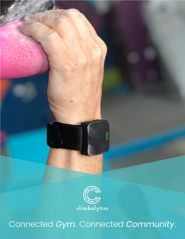
Climbalytics
From Wall to Dashboard: Designing a Climber-Friendly Tracking Experience
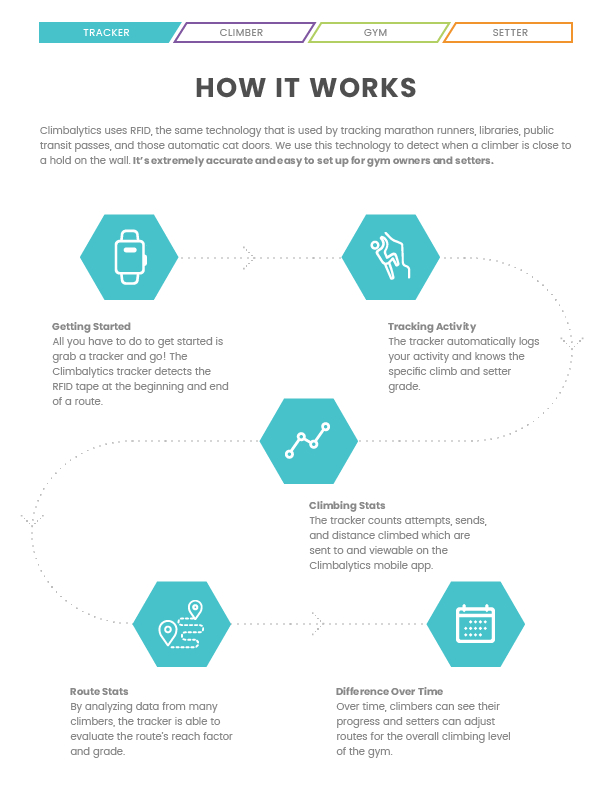
Climbalytics is a startup building a performance-tracking system for indoor climbers. Using RFID tape and sensors, the product collects data from climbing routes and sends it to a companion mobile app where climbers can visualize progress and stay motivated through meaningful performance metrics. I led the brand development, product design, and marketing collateral for both consumer and B2B use.
Role: Product Designer (Brand, Mobile App, and Marketing Collateral)
Team: Worked cross-functionally with founders and engineers
Platforms: iOS, Android, Web
Impact
+35%
Weekly Active Users
+22%
Average Session Time
Problem
As Climbalytics evolved from a hardware concept into a full product, several challenges emerged for users and the brand:
1. Complex Data Was Hard to Interpret
The tracker collected detailed performance data, but climbers struggled to understand what it meant or how it reflected their progress. The app needed to surface meaningful, motivational insights without overwhelming users.
The tracker collected detailed performance data, but climbers struggled to understand what it meant or how it reflected their progress. The app needed to surface meaningful, motivational insights without overwhelming users.
2. The App Needed to Fit Seamlessly Into Gym Workflows
Climbers interact with the product during and after physical activity in busy, shared spaces. The app had to be fast, intuitive, and usable in short bursts, whether between climbs, at the check-in desk, or post-session. It also needed to align with the existing flow of how gym users approach their workouts and interact with staff.
Climbers interact with the product during and after physical activity in busy, shared spaces. The app had to be fast, intuitive, and usable in short bursts, whether between climbs, at the check-in desk, or post-session. It also needed to align with the existing flow of how gym users approach their workouts and interact with staff.
Opportunity
How might we make it easy to track and understand climbing progress to motivate climbers?
Goals
Business Goal:
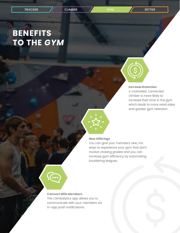
Build a compelling, data-focused brand and app experience that supports B2B sales to gyms and encourages long-term engagement from climbers.
User Goal:
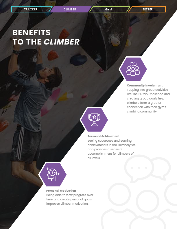
Help climbers see clear, rewarding progress over time with simple, motivating data visualizations that connect their workouts to improvement.
Design Process
01 / Research & Discovery
I spoke with climbers and reviewed climbing tracking apps and wearables. Most users wanted clarity, not complexity. They valued metrics like total sends, flashes, and difficulty level but often felt overwhelmed by overly detailed logs or poorly presented data.
02 / Flow Mapping
I mapped the user experience for both gym partners and climbers. For climbers, I focused on daily use, from completing a workout to reviewing progress. For gyms, I simplified how they could manage user onboarding and data tracking through the Climbalytics dashboard.
03 / Wireframes
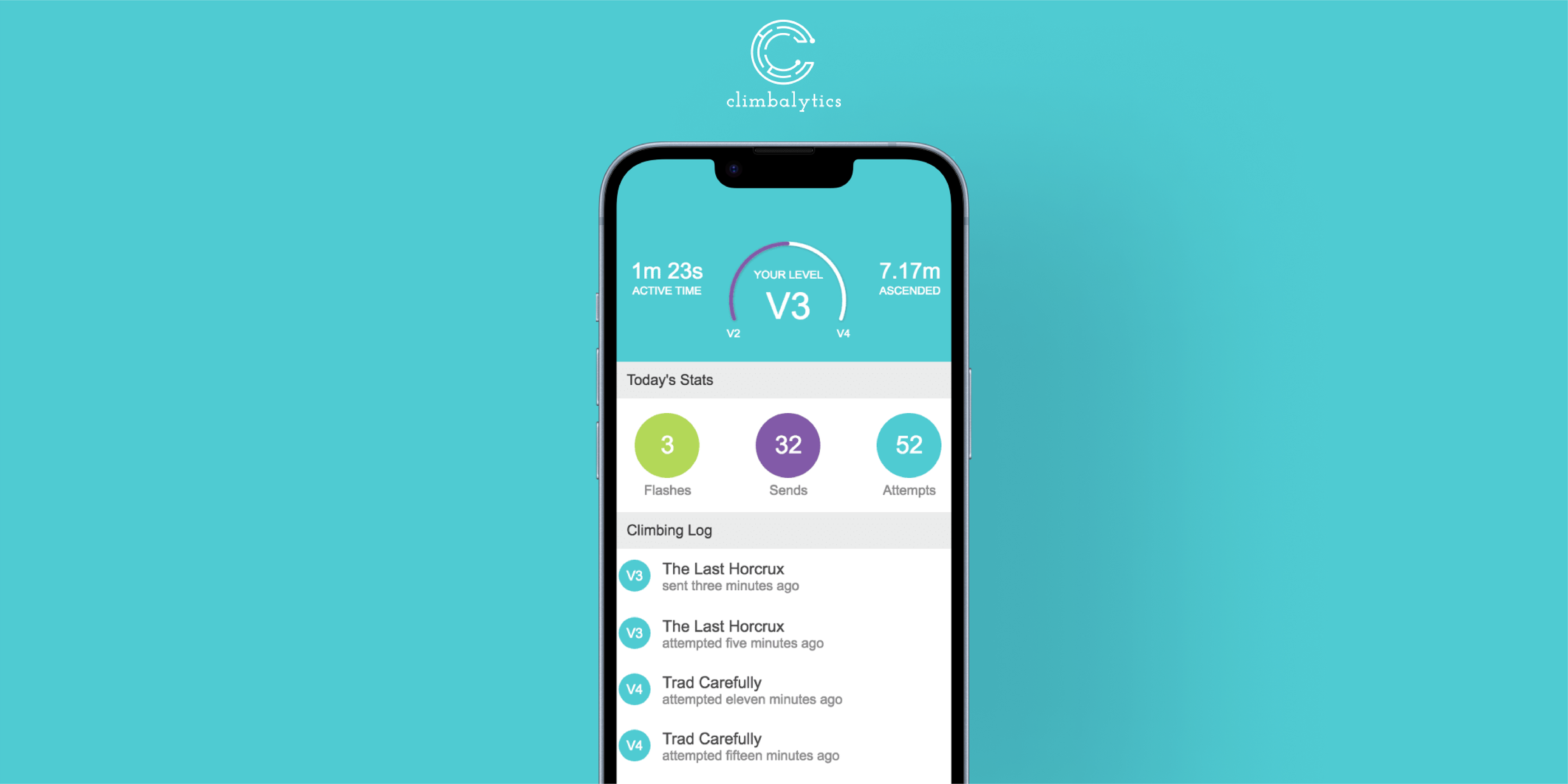
I created mid-fidelity wireframes to test feature prioritization and layout. I focused on clarity, accessibility, and emotional reward. Early tests showed that users wanted to see progress instantly, which informed my decision to put V-points and personal milestones front and center on the dashboard.
04 / Visual Concepts
I drew inspiration from fitness and productivity apps, introducing circular progress indicators and color-coded metrics. I also incorporated calendar-based visualizations to mimic the motivational design seen in tools like GitHub's contribution graph, helping users track consistency and frequency.
05 / Final Designs
The final app design featured a clean, intuitive layout with customizable metrics and a focus on positive reinforcement. I limited the number of actions per screen to reduce friction during workouts. Each feature was tested to ensure it delivered motivation without overwhelming the user.
06 / Implementation & Iteration
I worked closely with the Climbalytics team to implement the mobile designs across platforms and helped develop an infographic-style sales brochure to pitch the system to gyms. I also consulted on the structure and visual hierarchy for Climbalytics.com to ensure brand consistency across all touchpoints.
Reflection
This project challenged me to simplify complexity without losing depth. I learned how to design for dual user groups, individual athletes and B2B decision-makers, while creating a cohesive brand and product experience. Most importantly, I designed with empathy, helping climbers see their own growth in ways that felt visual, meaningful, and rewarding.
Branding
LOGO CONCEPTS


Final Climbalytics Logo
LOADING ANIMATION
Marketing & Sales Collateral
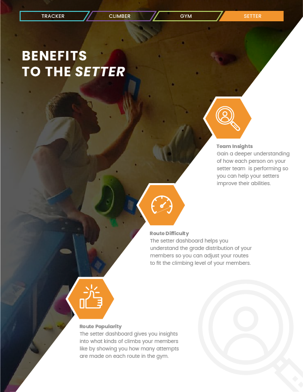
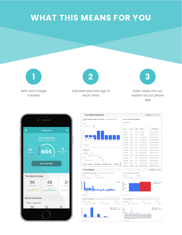
Designed a one-page infographic brochure to support sales conversations with gyms:
• Focused on clean layout and scannable content blocks
• Used visuals and key metrics to quickly explain the value of Climbalytics to busy gym owners
• Also provided design consultation for Climbalytics.com to ensure brand cohesion across touchpoints