FANSchool
Making Civics and Current Events Engaging Through Play
FANschool is a fantasy-sports-inspired education platform that helps students stay engaged with current events and civics by turning them into interactive classroom games. I led the full rebrand and redesign of the product to support a growing suite of games and an evolving user base of teachers and middle school students.
Role: Sole Product Designer
Scope: Brand strategy, design system, UI/UX for three products, marketing collateral
Platforms: Web, Mobile Web
Year: 2016
Impact
+25%
Classroom Signups
+32%
Student Sessions/Week
+$14k
Revenue/Year
+12k
Students Signed up for Election Challenge
Problem
1. A Technical, Table-Heavy UI Made Gameplay Hard to Learn
The interface looked and felt like a content management tool. It lacked visual hierarchy and playful structure. Students struggled to understand how to play, and teachers had to waste class time walking them through setup instead of jumping into the activity.
The interface looked and felt like a content management tool. It lacked visual hierarchy and playful structure. Students struggled to understand how to play, and teachers had to waste class time walking them through setup instead of jumping into the activity.
2. A Teacher-Focused Design Failed to Engage Students
The original design catered to educators with an academic, text-heavy tone. However, the actual users were middle school students who needed something visual, interactive, and rewarding in order to stay interested.
The original design catered to educators with an academic, text-heavy tone. However, the actual users were middle school students who needed something visual, interactive, and rewarding in order to stay interested.
3. Minimal Gamification Led to Low Motivation and Drop-Off
There were no badges, progress indicators, or visual rewards to keep students engaged. Without a sense of progress or accomplishment, students were less likely to continue using the platform over time.
There were no badges, progress indicators, or visual rewards to keep students engaged. Without a sense of progress or accomplishment, students were less likely to continue using the platform over time.
Opportunity
How might we increase student engagement and also allow teachers to set up and manage gameplay efficiently?
Goals
Business Goal
Reduce friction for teacher onboarding and game setup to increase adoption
User Goal
Make games visually engaging and easy to understand for middle schoolers (ages 10–13).
Design Process
01 / Research & Discovery
I began by interviewing teachers and observing how students interacted with the existing product. Teachers wanted tools that were easy to set up and manage, while students needed clear, gamified interfaces to stay motivated. I also audited the current product experience, identifying gaps in engagement, visual clarity, and consistency across games.
02 / Brand Architecture & Design
To support FANschool’s transition from a single game to a multi-product platform, I created a unified brand system. I renamed the company and its games using a clear and scalable structure (e.g., FANgeopolitics, FANpolitics, Election Challenge).
03 / Visual ConceptsI explored visual directions that balanced academic credibility with student appeal. I experimented with color palettes, typography, and icon systems to create a look that felt smart, bold, and fun. I also introduced more gamified elements, like badges and progress visuals, to increase motivation and engagement. I designed a badge-style logo for the master brand and game-specific icons.
Old Logo
New Logo


FANgeopolitics
FANpolitics
Election Challenge
03 / Flow Mapping
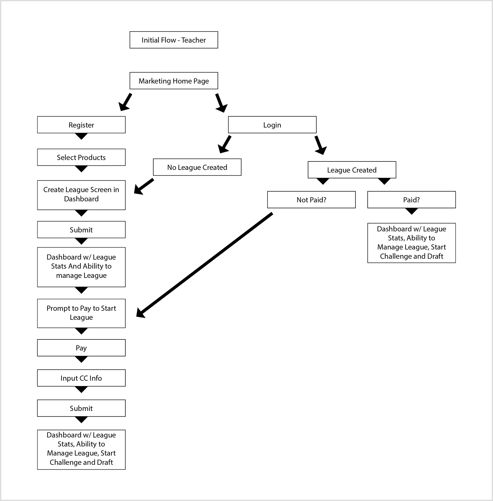
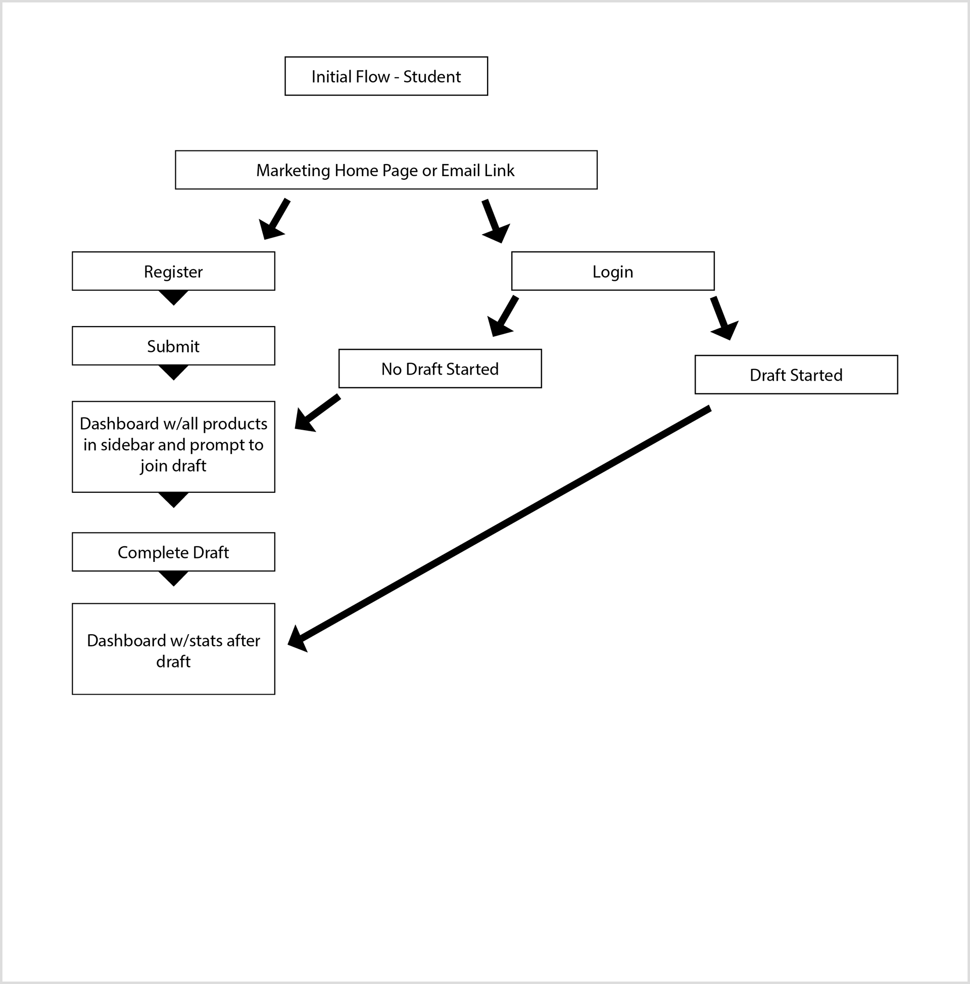
I mapped separate flows for teachers and students, making sure each user group had a streamlined experience. For teachers, I focused on reducing friction in onboarding, setup, and classroom management. For students, I simplified game interactions and emphasized clarity and progression to reduce confusion and increase repeat play.
TEACHER & STUDENT USER FLOWS
04 / Wireframes
Mid-fidelity wireframes helped me visualize and test the structure of key pages including the dashboard, game setup, and interactive gameplay areas. Feedback from early testing highlighted the need for stronger visual hierarchy and clearer onboarding cues. I refined layouts to reduce cognitive load and create a more intuitive path through the games.
OLD TABLE DESIGN
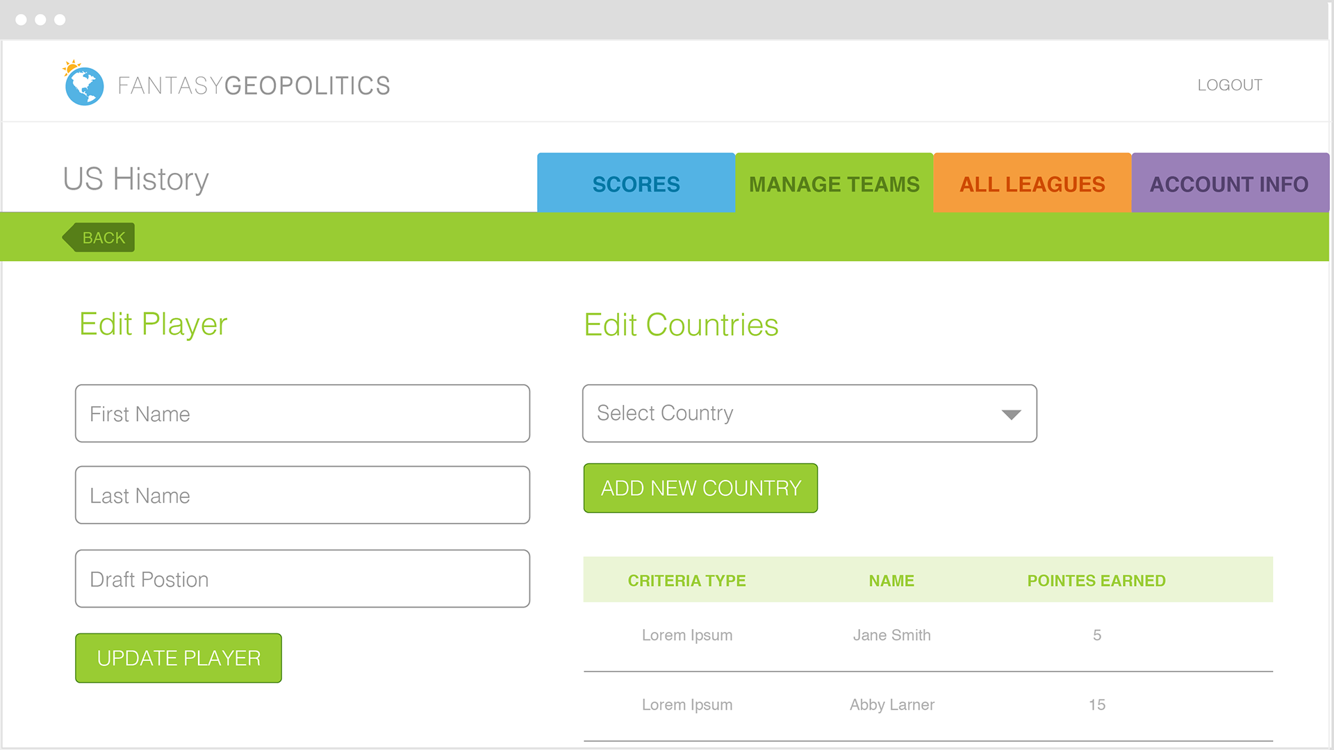
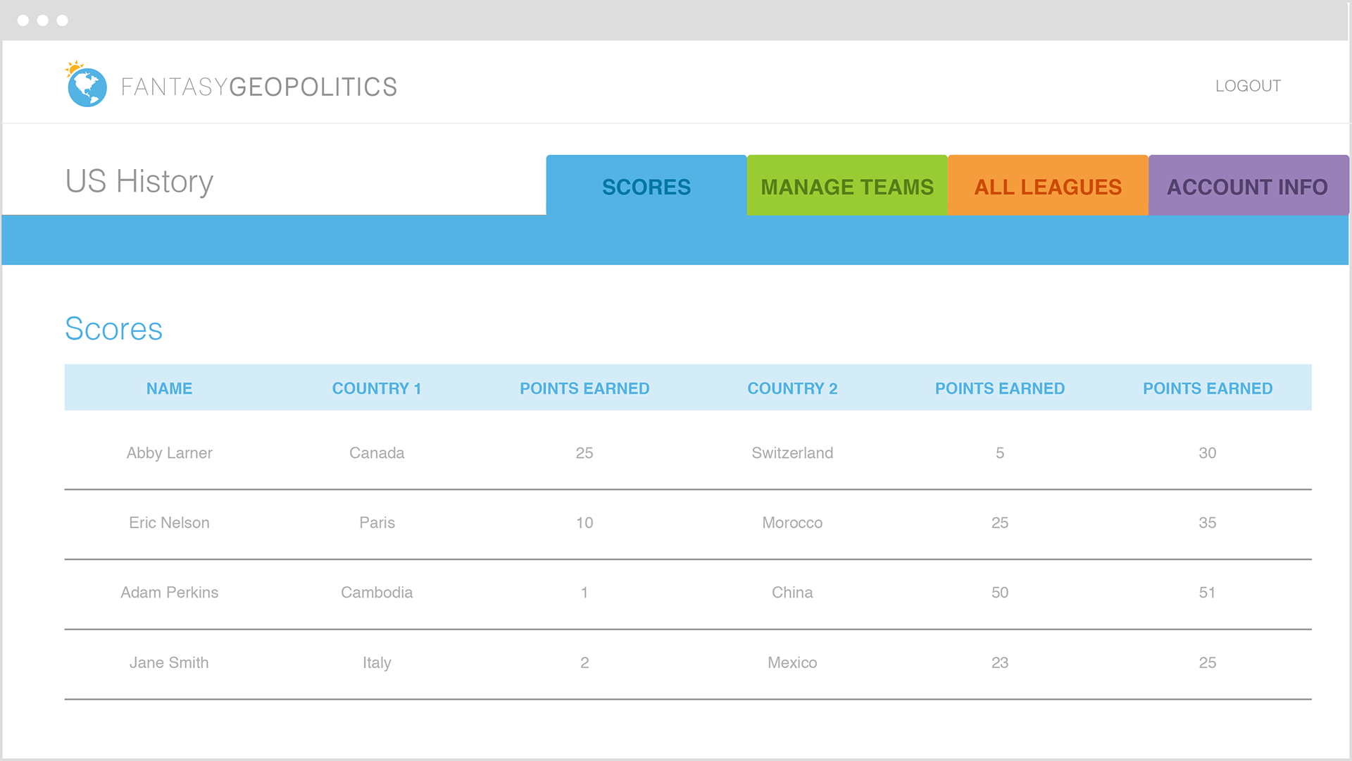
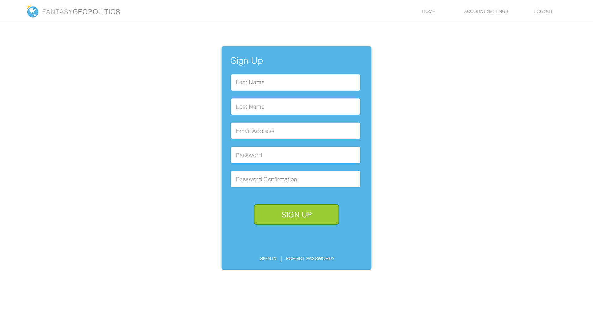
FANschool App Wireframes
06 / Final Designs
The final UI combined modular layouts, strong visual hierarchy, and playful elements to support both students and teachers. Game-specific maps and interactive components replaced table-heavy views, making the experience more intuitive and enjoyable. The design system supported consistent styling across all games and allowed for easy expansion in the future.
FANschool App Design
07 / Implementation & Iteration
I collaborated with the team to implement the new designs across the platform. After launch, I helped review live user feedback and analytics to guide ongoing improvements. I also designed supporting materials, including an infographic brochure and t-shirts, to help the sales team introduce the new brand and games to schools.
Election Challenge – A Timely Game to Drive Growth
Completed Election Challenge Map
Election Challenge Wireframes
To expand FANschool’s reach and take advantage of high student interest during the 2016 U.S. election, I designed Election Challenge as a short-term, high-impact game. Unlike the ongoing formats of FANgeo or FANstates, this game offered a quick, bracket-style experience where students predicted the outcome of each state using an interactive U.S. map.
Each round focused on different types of states such as solid, leaning, and battleground. I included brief, easy-to-understand descriptions to help students learn about the electoral process as they played. This format encouraged engagement and made it simple for teachers to bring current events into the classroom.
Key outcomes:
• Created an easy entry point for new teachers who wanted to try FANschool without a long-term commitment
• Increased student participation by aligning gameplay with a timely, real-world event
• Led to more than 12,000 student signups, significantly growing the user base and raising awareness of other FANschool games
The success of Election Challenge confirmed that short-term, event-based games could be a powerful way to attract new classrooms and encourage broader use of the platform.
Reflection
This project challenged me to design for two very different users, teachers and 11-year-olds, without compromising usability or fun. It taught me how to build a design system that’s both scalable and emotionally resonant, and how to align branding, product, and marketing to support a growing business. Most of all, it showed me how good design can turn learning into play.